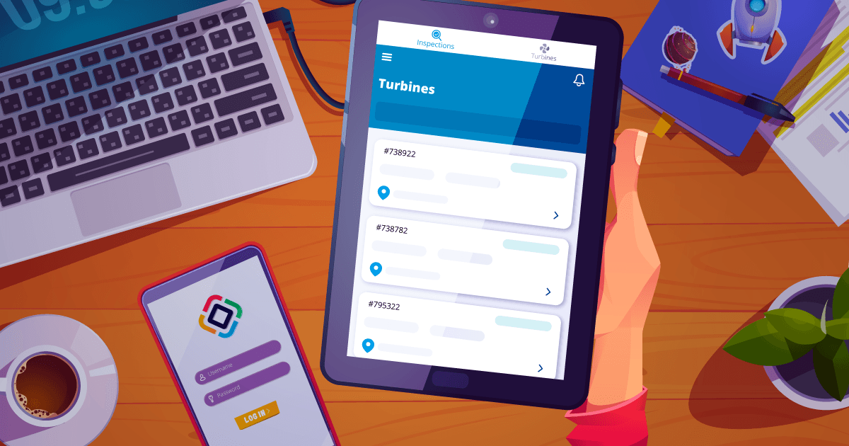
In this blog post, we will explore how to build mobile business web applications using Jmix and Vaadin Flow. In the first blog post about this topic, we talked about the business reasons for creating cost-efficient mobile apps with Jmix and introduced the Jmix Wind Turbines example as one showcase of such an application.
This time, we’ll dive into the technical aspects. First by focusing on how the latest features in Jmix 2.x and Vaadin Flow enable responsive and mobile-friendly business applications. Then, we will look at different architectural approaches to building mobile Jmix web applications. Finally, we will explore the technical details of the Wind Turbines project and how we implemented it.
1. Vaadin Flow and Mobile Responsive Layouts in Jmix
Vaadin Flow improved the support for responsive and mobile-friendly web application significantly over the previous generation of Vaadin: Vaadin 8. With the transition from Jmix 1.x to 2.x the new Vaadin generation: Vaadin Flow is used as the UI framework. This means that those improvements for mobile and responsive design are now available to Jmix developers. While Jmix 1.x relied on Vaadin 8, which required more manual handling of responsiveness using CSS and the “setResponsive” method, the introduction of Vaadin Flow in Vaadin 10 marked a shift toward more modern approaches to layout and design.
Since the introduction of Vaadin Flow in Version 10, there have been numerous enhancements that simplify mobile responsiveness, especially with the introduction of FlexLayout and improvements to HorizontalLayout and VerticalLayout, which now utilize the CSS Flexbox model. This has made it much easier to create layouts that adapt dynamically to different screen sizes without requiring extensive custom CSS. Flexbox-based layouts allow components to resize, align, and adjust spacing automatically, ensuring that applications work seamlessly across various device types.
Some layout components like the FormLayout in Vaadin Flow / Jmix 2.x are already mobile optimized by default. This means that forms built with FormLayout dynamically reorganize fields into a grid-like structure with one or more columns, optimizing the display across different devices without needing additional customization.
Other UI components like the DatePicker or the select component adapt their behavior based on the device type, to provide an optimal user experience when used on touch devices as well as when used with a mouse on a larger screen.
Finally, Vaadin Flow offers utility classes that simplify responsive design by enabling developers to show or hide elements based on the viewport size. These advancements help developers to build Progressive Web Apps (PWAs) that are mobile-optimized and responsive with less effort in Jmix 2.x, compared to the manual techniques that were common in Jmix 1.x.
Further Information
- Building Responsive Websites with Java and Vaadin Flow
- Building Responsive Layouts with Vaadin Utility Classes
- Form Layout in Vaadin 24 Documentation
- A Guide to Flexbox - CSS Tricks
2. Architectural Options for Building Mobile Web Apps with Jmix
Before diving into the technical details of how to utilize the Improvements from Vaadin Flow, when building a mobile web application, there are also some architectural considerations to think about. In this section we will investigate the different options we have when it comes to coming up with a solution architecture for a mobile web application with Jmix.
Each approach comes with its own set of trade-offs, offering specific benefits and challenges depending on the project requirements. In this section, we’ll explore three common strategies for mobile web app development with Jmix, each suited to different needs in terms of complexity, scalability, and development speed.
Option 1: Unified Jmix Application with Responsive Mobile Views
The first approach is to adapt an existing Jmix business application by making its views responsive for mobile devices. With the features provided by Vaadin Flow, such as out-of-the-box responsive layouts, it’s easier than ever to create mobile-friendly interfaces within your existing Jmix app.
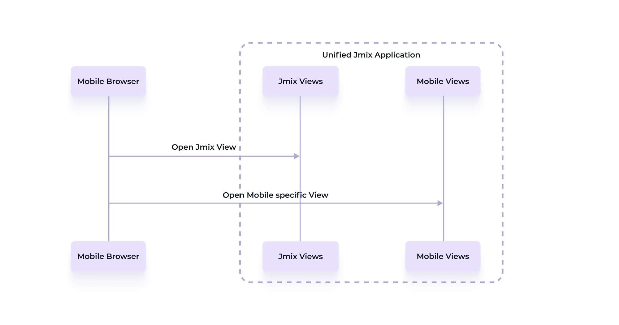
This approach is particularly useful when the mobile web app needs to offer a large portion of the same functionality as the desktop application. By utilizing responsive design and reusing existing components, you can efficiently deliver a Progressive Web App (PWA) without creating a separate mobile application.
It also allows you to progressively optimize views for mobile use while keeping everything within the same codebase. For example, you can start by using mobile-friendly out-of-the-box components like FormLayout, which require minimal effort to become fully responsive. From there, you can incrementally enhance other views, such as List Views or custom views, for a seamless mobile experience.
This approach also offers flexibility in how you handle mobile optimization. Developers can choose to route mobile users to dedicated views specifically optimized for mobile devices, or they can apply responsive design techniques to ensure the same view adapts across different devices. When comparing the solution to the next option the outcome for the end user might be the same. The main difference is that in this unified approach, all views live within the same application, minimizing architectural complexity while delivering a mobile-optimized user experience.
Option 2: Dedicated Mobile Web App with Jmix and Separate (Jmix) Backend
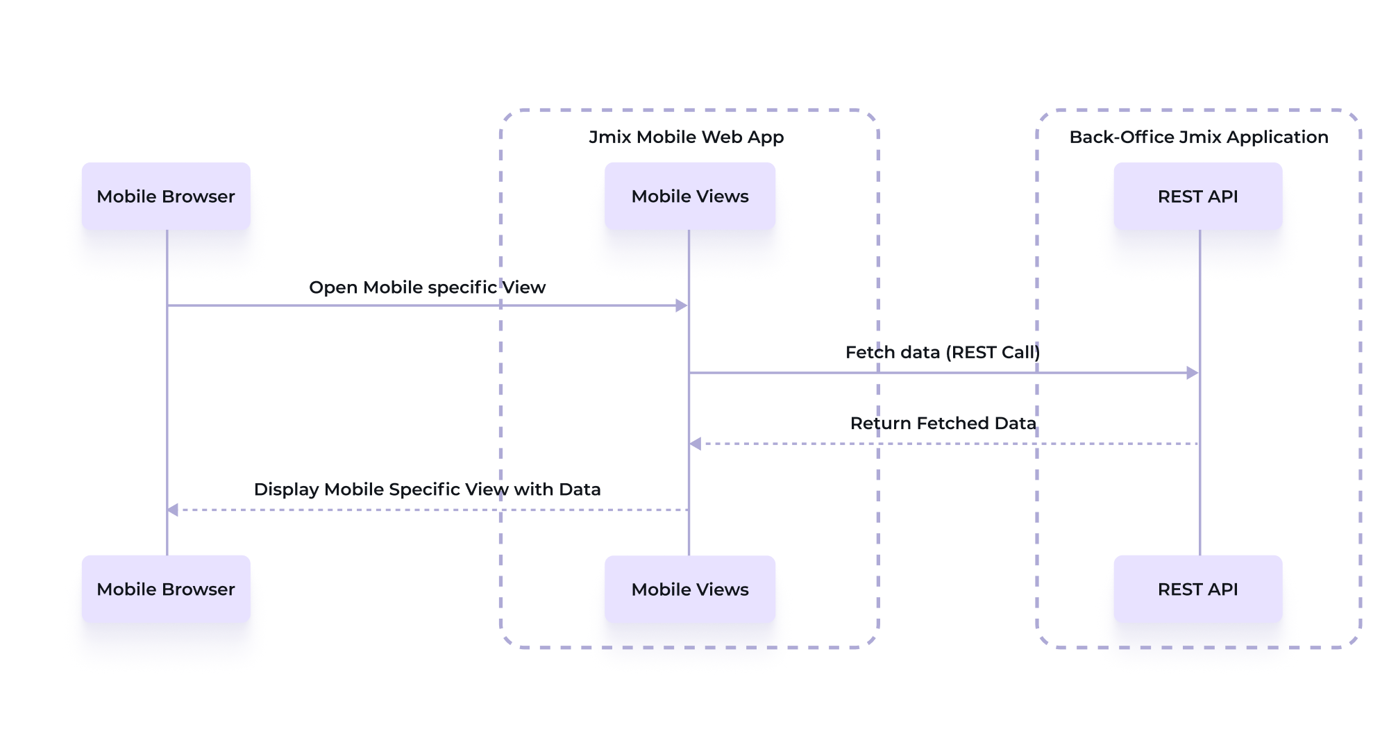
If you want a clear architectural separation between your mobile user experience and the back-office system, building a dedicated mobile web app with Jmix can be advantageous. This approach is useful in scenarios where the mobile app is intended for a different user group or requires a completely different design or layout from the back-office interface. It could also be necessary to have such a separation due to security restrictions.
In the Wind Turbines example, a dedicated mobile web app could be a good choice if the fieldworkers are external partners, such as subcontracted companies, who only need access to a small, well-defined subset of the data and functionality.
This streamlined mobile web app would feed into a larger, more complex business process within the company’s internal systems. For example, once an inspection is submitted by a fieldworker, a BPMN process could be triggered in the back-office system. This process could involve additional approvals, notifications to customers, or internal follow-ups. By separating the mobile app from the back-office system, you can create a bounded context that ensures the mobile app handles only the necessary tasks while integrating with the broader business logic. In this bounded context the data model could be a small subset or even different from the back-office system, as it only needs to represent the needs of the mobile use-cases.
Another benefit of this separation is that oftentimes different authentication schemes apply for different user groups. For instance, the external fieldworkers might authenticate using the built-in username and password functionality from Jmix, while internal users accessing the back-office system might rely on an enterprise-wide SSO solution (like Okta, Microsoft Azure AD etc.) that is not exposed to third parties.
By decoupling the mobile frontend from the backend, this architecture supports a more flexible and modular design. However, it also introduces the complexity of managing multiple systems and distributed computing in general. A dedicated Mobile Web App built with Jmix can either function purely as a presentation or UI layer, or it can be a full-stack application with its own persistence layer. In the first case, the mobile app acts as a thin client, interacting with a backend system (like a Jmix-based back-office) purely via REST APIs. This keeps the mobile app lightweight, as it does not manage any data storage directly, relying entirely on the backend for all persistence and data retrieval.
Alternatively, the mobile app can be a full-stack Jmix application with its own database, handling persistence independently. This option offers greater flexibility, as it allows the app to store data optimized specifically for mobile use cases or to maintain additional information that may not be relevant to the back-office system. However, it requires establishing a data synchronization mechanism between the mobile app and the back-office system, whether through asynchronous synchronization or by forwarding the data changes synchronously to the back-office system when the data is changed in the mobile web app. Storing the data persistently on the mobile web app increases resilience due to temporal decoupling—the mobile app can continue functioning even if the back-office system is temporarily unavailable.
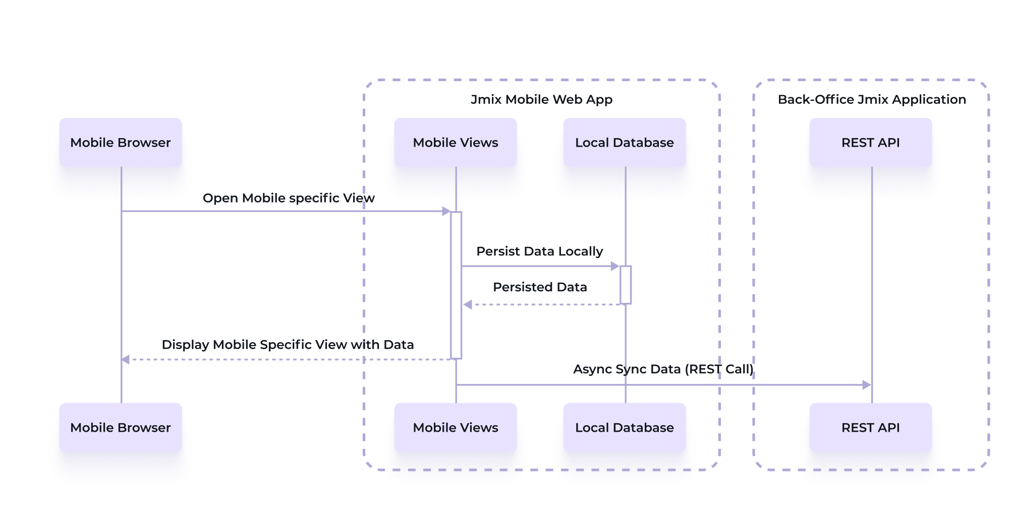
Whether to choose a thin client approach or a full-stack application depends on the specific project requirements and the balance between flexibility and complexity. Jmix supports both, the thin client as well as the dedicated full stack application approaches. In the following section, we’ll explore how Jmix’s new REST Datastore in Jmix 2.4 makes the thin client approach very easy to achieve, where the mobile app functions without its own persistence layer and interacts with the backend through REST.
Leveraging the REST Datastore in Jmix 2.4
A key feature introduced in Jmix 2.4 is the REST Datastore, which simplifies the interaction between the mobile app and the backend in case the backend is also built with Jmix. With the REST Datastore, developers can use Jmix’s built-in UI components and data binding mechanisms as they normally would, but instead of interacting with a local database, the data is fetched and saved via REST APIs from a remote Jmix backend.
This eliminates much of the boilerplate code typically needed for manual REST API interactions. Instead of writing custom code to send requests, handle responses, and map data between the mobile web app and backend, the REST Datastore abstracts these operations. Jmix handles the underlying REST communication seamlessly as long as the backend application also uses Jmix and exposes the API via the generic REST API add-on.
Option 3: Dedicated Native or Web App with Jmix as Backend
The third architectural option involves building a dedicated frontend using technologies like React, Vue, or Angular, while Jmix serves exclusively as the backend. In this model, the mobile web app interacts with Jmix through REST APIs rather than using Vaadin Flow for the UI.
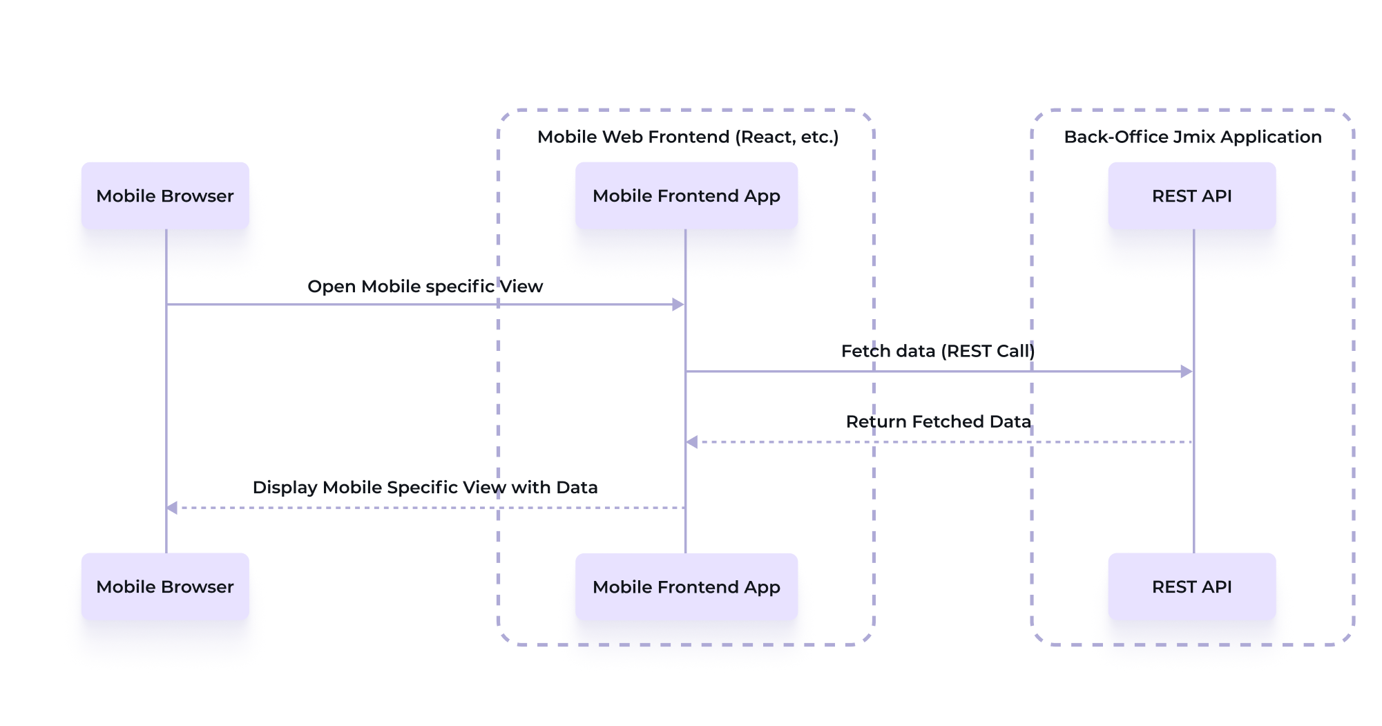
One important aspect with Vaadin Flow is its communication architecture between the browser and the server, which relies on frequent HTTP interactions. Most of the UI interactions, like button clicks trigger server-side logic. While this transparent communication simplifies the programming model for many business applications, it requires a reliable internet connection to maintain the constant interaction between the browser and server. This can be a limitation for mobile web apps in environments where network connectivity is intermittent or slow, as interruptions can affect the user experience. In case this becomes a problem, a looser coupling between frontend and backend becomes advantageous. In this setup, the frontend is entirely client-side, and the server only handles stateless requests via REST APIs. This architecture is better suited for offline capabilities, where the app can continue functioning and synchronize with the backend once connectivity is restored.
By using Progressive Web App (PWA) technologies or frameworks like React Native, developers can create highly responsive mobile web apps that offer a more seamless experience in low-connectivity environments.
While this option provides greater flexibility, it is traditionally more complex to implement. Separate frontend and backend codebases require additional maintenance and building a fully stateless mobile web app demands more initial setup compared to the other Jmix-based options. However, for projects that prioritize customization, offline support, or need a more disconnected architecture, this is often the most suitable choice. Also, the existing knowledge within the team plays a crucial role. In case your team has dedicated front-end experience, it can also be beneficial to consider this option.
Choosing the Right Architectural Approach for Your Mobile Web App
Option 1 is our recommended option for teams that are just starting to build mobile web applications with Jmix but also for projects where maintaining a simple, unified architecture is critical. It’s ideal when there isn’t the need or ability to manage multiple deployment units, as in a microservices-based architecture.
It was also chosen for the Jmix Wind Turbines project because of its simplicity and the focus on demonstrating the speed of development with Jmix.
Option 2 is preferable if you want to decouple your mobile web application from your back-office application for one of the mentioned reasons. It brings some additional complexity in exchange with the gained flexibility, but still leverages the development speed and convenience from Jmix 2.x / Vaadin 24 for the mobile web app.
In case the characteristics of the Vaadin Flow architecture are not enough or there are very specific UI / UX requirements that are not easily achievable with Vaadin, then Option 3 might be the best option. It is the most costly in terms of development efforts and requires skills in the selected technology, but it also brings the freedom to choose the exact technology that fits the specific needs. Jmix in this case acts as the backend that provides access to the data model via REST API, authentication and authorization and potentially back-office functionality like BPMN engine etc.
By using one of these architectural approaches, you can tailor your mobile web app development to suit the specific needs of your project. A unified Jmix application is ideal for quick and cost-effective solutions, while dedicated mobile web apps provide more flexibility and scalability when mobile-specific requirements are a priority.
3. Technical Implementation of the Jmix Wind Turbines
After investigating the Jmix 2.x and Vaadin improvements and discussing the architectural options for mobile application, we will now get more concrete and see how to apply these various improvements in more detail.
As mentioned above, the Jmix Wind Turbines example uses the architectural option 1 which combines the mobile UI and the back-office application into one deployment artifact.
In this section we will cover different aspects of the Wind Turbines implementation: how to enable PWA functionality, the use of mobile optimized Vaadin components like “VirtualList”, leveraging and adapting Jmix view generation for mobile use, and customizing styles to create a good look & feel on a mobile device.
Enabling PWA Functionality
To enable PWA functionality in your Jmix application, you use the @PWA annotation from Vaadin. Every Jmix application has this annotation already active by default when a new project is created via Jmix Studio.
This annotation transforms your web application into a Progressive Web App (PWA), which can be installed on a user’s device, providing an app-like experience. The @PWA annotation includes multiple configuration options such as name, shortName, backgroundColor, and display, which influence the look & feel of the installed PWA.
In the Jmix Wind Turbines application, the PWA functionality is added to the application class:
import com.vaadin.flow.component.page.AppShellConfigurator;
import com.vaadin.flow.component.page.Push;
import com.vaadin.flow.server.PWA;
import com.vaadin.flow.theme.Theme;

@Push
@Theme(value = "jmix-windturbines")
@PWA(name = "Windturbines", shortName = "Jmix WT", backgroundColor = "#235FD5", display = "standalone")
@SpringBootApplication
public class JmixWindturbinesApplication implements AppShellConfigurator {
    public static void main(String[] args) {
        SpringApplication.run(JmixWindturbinesApplication.class, args);
    }
}
The display attribute defines how the web app is presented on the mobile operating system. There are four main modes:
Standalone and fullscreen modes are designed to run the app in its own window, separate from the browser. In these modes, browser UI elements like the address bar and navigation are hidden, creating a focused, immersive interface. This is particularly suitable for applications that are supposed to look very close like a native application. Fullscreen mode goes a step further by using the entire screen, which is normally not common for business applications. When using standalone / fullscreen it is important that the app itself has properly built-in navigation capabilities
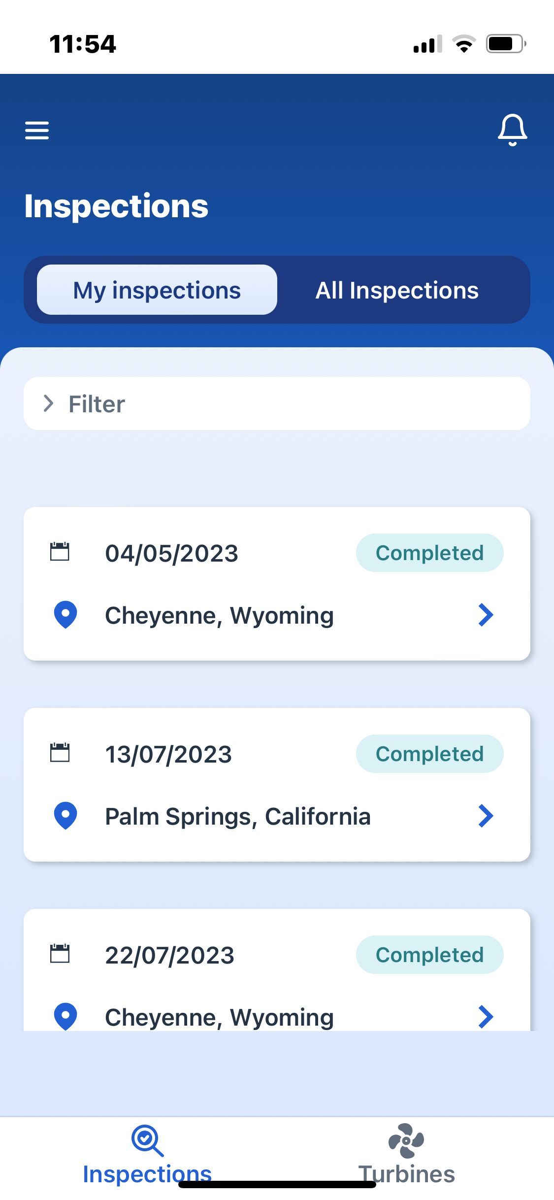
Minimal-UI mode is similar to standalone mode but retains some browser UI elements like the address bar, which cannot be typed into. This mode is useful for applications that require some browser features like browser refresh or the back button, providing a balance between a full browser experience and a standalone app. It is beneficial for simple web pages that need basic browser functionalities.
Browser mode, on the other hand, makes the app behave like a regular web page within a browser tab, retaining the full browser UI. This mode is best for content that requires extensive navigation or multi-tab support, such as news websites or blogs. This mode also does not create a dedicated application in the App switcher of the operating system. This means that to switch between the application and a regular website in your browser, you must use the switch tab functionality of the browser.
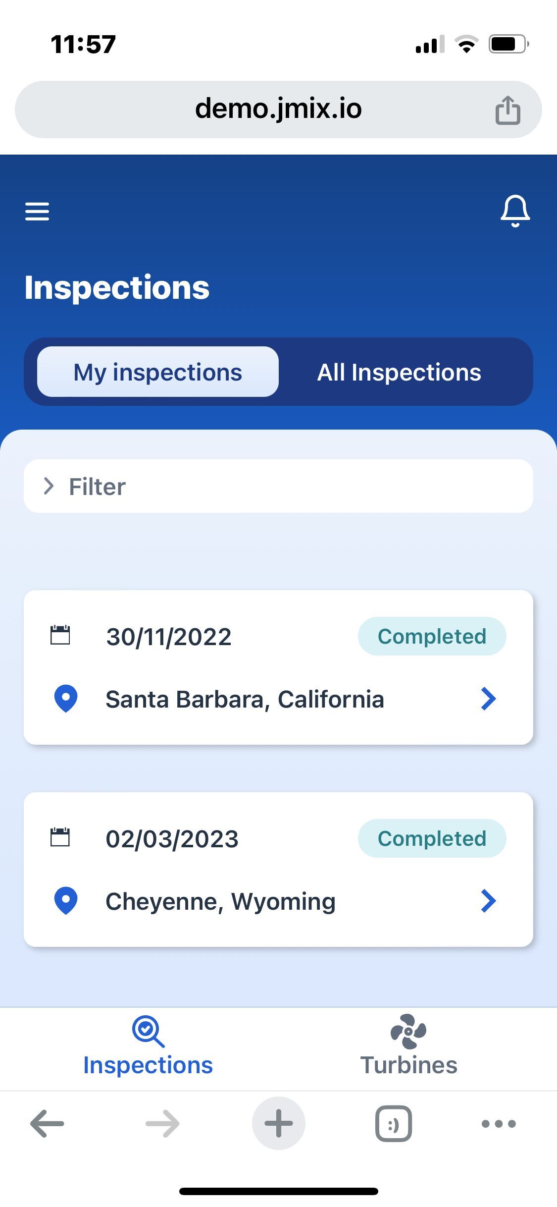
Although the PWA specification defines all those display modes, not all operating systems support them (yet). For iOS e.g. it only supports “standalone” and “browser” modes with fallbacks for the other modes.
For the Jmix Windturbines app, we use the standalone mode, which is also the default setting from Vaadin’s @PWA annotation.
Optimizing Mobile Data Views via Card Layout
In Jmix applications, list views are typically generated using DataGrids. While they are efficient for desktop views, they are not optimal for mobile interfaces due to the horizontal scrolling required to view multiple columns. Representing a list of items on mobile is typically done by displaying each item underneath the other.
Using a card layout improves the user experience on mobile devices. It organizes information into distinct, easily readable sections that fit well within the vertical space of a mobile screen. This layout is technically supported by Vaadin’s VirtualList, allowing for the creation of a dynamic, responsive UI.
To create a more mobile-friendly interface, you can start with a standard CRUD UI and then replace the DataGrid with the <virtualList /> XML tag. The data binding is the same as for DataGrid. The difference is that instead of defining a set of columns to render, you define a handler function that returns a component to be displayed for each item.
Let’s explore how we used the VirtualList component for the Turbine List View. Here is the XML view descriptor:
<?xml version="1.0" encoding="UTF-8" standalone="no"?>
<view xmlns="http://jmix.io/schema/flowui/view"
      title="msg://turbineListView.title"
      focusComponent="turbinesVirtualList">
    <layout spacing="false" padding="false">
        <!-- ... -->
        <vbox classNames="layout-body" width="100%" height="100%" padding="false" spacing="false">
            <vbox width="100%" classNames="light-background" padding="false">
                <scroller width="100%" height="100%">
                    <virtualList id="turbinesVirtualList"
                                 width="100%"
                                 height="100%"
                                 itemsContainer="turbinesDc"
                                 alignSelf="CENTER">
<fragmentRenderer class=" io.jmix.windturbines.view.turbine.TurbineCard"
                                 />
	</ virtualList >
                </scroller>
            </vbox>
        </vbox>
    </layout>
</view>
We use the <virtualList /> tag to create a virtual list and bind it to the turbinesDc data container.
Now, there are two approaches to display each turbine instance within the list:
1. Using Fragment Renderer (New in Jmix 2.4)
In Jmix 2.4, you can declaratively specify a fragment to render each list item using the FragmentRenderer. This approach simplifies the process by automatically binding the data to the fragment’s instance container. In the above XML, the fragmentRenderer points to a TurbineCard fragment, which encapsulates the UI and logic for displaying a turbine’s details.
The data binding is handled by Jmix, and we simply configure how to display the turbine details declaratively. This method works well if you don’t need to inject dynamic content into the fragment at runtime.
2. Programmatic Rendering with the Fragments API
Alternatively, if your use case requires more dynamic handling, such as injecting additional parameters or handling callbacks, you can define a custom renderer method programmatically. In this approach, we use the Fragments API to create and configure each fragment instance manually. This allows for greater flexibility, as you can pass data or state directly to the fragment based on runtime conditions.
Here’s an example of how this can be achieved using the Fragments API to dynamically render inspection cards and dynamically react to actions that happen within the fragment:
public class InspectionListView extends StandardListView<Inspection> {

    @Autowired
    private Fragments fragments;

   // ...

   @Supply(to = "allInspectionsVirtualList", subject = "renderer")
    private Renderer<Inspection> allInspectionsVirtualListRenderer() {
        return new ComponentRenderer<>(inspection -> {
            AllInspectionCard card = fragments.create(this, AllInspectionCard.class);
            card.setInspection(inspection);
            card.setAfterAssignmentPerformedHandler(it -> {
                contentTabSheet.setSelectedTab(contentTabSheetMyInspectionsTab);
                getViewData().loadAll();
            });
            return card;
        });
    }
}
Utilizing Fragments for Reusable Components
Fragments are a Jmix mechanism introduced in Jmix 2.3 that allows to define reusable components declaratively using XML. In our example, we used Fragments to create a TurbineCard component. This component encapsulates all the necessary UI elements and logic to display a turbine’s details in a card layout. By using Fragments, we can define the layout definition of the turbine card in XML in the same way it works for general views.
Here is how we defined a TurbineCard fragment via XML:
<?xml version="1.0" encoding="UTF-8" standalone="no"?>
<fragment xmlns="http://jmix.io/schema/flowui/fragment">
    <data>
<instance id="turbineDc"
                  class="io.jmix.windturbines.entity.Turbine"/>
    </data>
    <actions>
        <action id="detailsAction"/>
    </actions>
    <content>
        <vbox id="root"
              padding="false"
              spacing="false"
              classNames="white-card cursor-pointer turbine-list-white-card m-m">
            <hbox width="100%" classNames="gap-m p-s">
                <span id="turbineId" dataContainer="turbineDc" property="turbineId" classNames="font-bold"/>
                <hbox justifyContent="END" width="100%">
                    <span id="statusBadge"
                          width="120px"
                          dataContainer="turbineDc"
                          property="status"
                          themeNames="badge pill"
                          classNames="turbine-status"/>
                </hbox>
            </hbox>
            <hbox width="100%" classNames="gap-xl p-s">
                <span dataContainer="turbineDc" property="manufacturer" id="manufacturerName"/>
                <span dataContainer="turbineDc" property="model" id="model"/>
            </hbox>
            <hbox width="100%" classNames="gap-m p-s">
                <hbox alignItems="CENTER" width="100%">
                    <svgIcon resource="/windturbines/icons/location.svg"/>
                    <span id="location"
                          dataContainer="turbineDc"
                          property="location"
                          width="100%"
                          classNames="cut-overflow-text"/>
                </hbox>
                <hbox padding="false" justifyContent="END">
                    <button action="detailsAction" icon="CHEVRON_RIGHT"
                            themeNames="tertiary-inline"/>
                </hbox>
            </hbox>
        </vbox>
    </content>
</fragment>
In the Java controller we define how the data is set for the components from the turbine instance.
@FragmentDescriptor("turbine-card.xml")
@RendererItemContainer("turbineDc")
public class TurbineCard extends Fragment<VerticalLayout> {

    @Autowired
    private ViewNavigators viewNavigators;
    @ViewComponent
    private Span statusBadge;
    @ViewComponent
    private InstanceContainer<Turbine> turbineDc;

@Subscribe(id = "turbineDc", target = Target.DATA_CONTAINER)
public void onTurbineDcItemChange(final InstanceContainer.ItemChangeEvent<Turbine> event) {
    statusBadge.getElement().getThemeList().add(event.getItem().getStatus().getBadgeThemeName());
}


    @Subscribe
    public void onReady(final ReadyEvent event) {
        getContent().addClickListener(e -> navigateToDetailView(turbineDc.getItem()));
    }

    @Subscribe("detailsAction")
    public void onDetailsAction(final ActionPerformedEvent event) {
        navigateToDetailView(turbineDc.getItem());
    }

private void navigateToDetailView(Turbine turbine) {
    viewNavigators.detailView(UiComponentUtils.getCurrentView(), Turbine.class)
            .withReadOnly(true)
            .editEntity(turbine)
            .navigate();
}
}
By leveraging recent improvements form Jmix 2.x we can use Vaadin’s VirtualList and Jmix’s Fragments, we can create mobile-friendly list views that enhance the user experience over a regular data grid.
Enhancing Mobile Views with Customized Detail Layouts
One of the key strengths of Jmix is the ability to quickly generate standard CRUD views using Jmix Studio. These views provide a robust foundation that can be easily customized to fit specific application needs. In this section, we will demonstrate how to generate a standard detail view for the Turbine entity and then customize it to enhance usability and appearance.
Generating Standard CRUD Views
Using Jmix Studio, you can generate a standard detail view for any entity. This view typically includes fields for each property of the entity, allowing users to view and edit the entity’s data. For the Turbine entity, the generated detail view includes fields for attributes such as turbineId, manufacturer, location, status, and others.
Using TabSheet for Improved UX
To improve the user experience, especially on mobile devices, we use a TabSheet layout to organize the detail view into multiple sections. This approach prevents overcrowding the screen with too many components and reduces the need for excessive scrolling. Each tab can represent a logical grouping of information, making it easier for users to find and interact with the data.
Here is an example of how the TabSheet layout is used in the turbine detail view:
<view xmlns="http://jmix.io/schema/flowui/view"
      title="msg://turbineDetailView.title"
      focusComponent="contentTabSheet">
    <!-- ... -->
    <layout spacing="false" padding="false">
        <vbox classNames="layout-header">
            <hbox width="100%" alignItems="CENTER" expand="spacer">
                <button id="backBtn" action="back" classNames="back-button"/>
                <span id="spacer"/>
                <svgIcon resource="icons/notification.svg"/>
            </hbox>
            <h3 id="pageTitle" classNames="page-title"/>
        </vbox>
        <tabSheet id="contentTabSheet" width="100%" themeNames="minimal equal-width-tabs" height="100%"
                  classNames="content-tab-sheet">
            <tab id="detailsTab" label="msg://details">
                <vbox classNames="layout-body" width="100%" height="100%" padding="false" spacing="false">
                    <vbox width="100%" classNames="light-background" padding="false">
                        <scroller width="100%" height="100%">
                            <vbox width="100%" padding="true">
                                <vbox width="100%" classNames="white-card">
                                    <formLayout id="detailsForm" dataContainer="turbineDc">
                                        <responsiveSteps>
                                            <responsiveStep minWidth="0" columns="2"/>
                                        </responsiveSteps>
                                        <textField id="turbineIdField" property="turbineId"/>
                                        <formItem label="msg://io.jmix.windturbines.entity/Turbine.status"
                                                  classNames="status-field-form-item">
                                            <span id="statusField"/>
                                        </formItem>
                                        <textArea id="locationField" property="location" colspan="2"/>
                                    </formLayout>
                                </vbox>
                                <!-- Additional form sections -->
                            </vbox>
                        </scroller>
                    </vbox>
                </vbox>
            </tab>
            <!-- Other tabs -->
        </tabSheet>
    </layout>
</view>
Adjusting visual appearance of Vaadin components through CSS
The final step in creating a polished detail view is customizing the CSS to ensure that the UI components are visually appealing and consistent with the application’s design language.
With Jmix 2.x and Vaadin 24 the styling of components is now done using standard CSS, which can be applied to the generated views. This is different from the Jmix 1.x / Vaadin 8 based approach with having a Sass as CSS-preprocessor. Recent developments in the world of CSS have made most of the functionality of CSS preprocessors obsolete, like the ability to define CSS variables.
Jmix organizes CSS files under the src/main/frontend/themes/<
frontend/
└── themes/
    └── jmix-windturbines/
        ├── shared/
        │   ├── background.css
        │   ├── buttons.css
        │   ├── cursor.css
        │   ├── tabsheet.css
        │   ├── text.css
        │   ├── vaadin-lumo-defaults.css
        │   ├── variables.css
        ├── view/
        │   ├── finding-detail-view.css
        │   ├── inspection-list-view.css
        │   ├── login-view.css
        │   ├── main-view.css
        │   ├── tabsheet.css
        │   ├── turbine-detail-view.css
        │   ├── turbines-list-view.css
        ├── jmix-windturbines.css
        ├── styles.css
        └── theme.json
In case you want to create new style definitions for new views, you have to add the new file via the @import directive in the main styles.css file.
Let’s look into the example on how we styled the <tabSheet /> component, so that it matches the look & feel of the Windturbines example:
jmix-tabsheet.content-tab-sheet::part(tabs-container) {
    background-color: var(--dark-blue);
    border-radius: 15px;
    padding: 5px;
    margin: 4px 16px 16px;
    height: 36px;
}

jmix-tabsheet.content-tab-sheet vaadin-tab {
    color: var(--lumo-base-color);
}

jmix-tabsheet.content-tab-sheet vaadin-tab[selected] {
    background: linear-gradient(180deg, #EBF2FC 0%, #DBE8FD 100%);
    color: var(--dark-blue);
    border-radius: 10px;
    margin-top: 5px;
    margin-bottom: 5px;
}

jmix-tabsheet.content-tab-sheet::part(content) {
    padding: 0 !important;
}
Styling Vaadin components can be slightly different from traditional CSS due to the use of the Shadow DOM. This mechanism encapsulates the component’s styles, preventing them from affecting the rest of the application and vice versa. To style these components, you need to use the ::part pseudo-element.
For detailed information on how to style Vaadin components using the Shadow DOM, you can refer to the Jmix Styling UI Components Guide.
Additionally, Vaadin documents all parts & states of their components so that it is easier to style them accordingly: Vaadin Tabs Styling Documentation.
Enhancing Mobile Views with Vaadin Utility CSS Classes
Vaadin 24 offers a collection of Utility CSS Classes that help you quickly build responsive and mobile-friendly layouts. These classes can be applied directly in XML views or programmatically in Java code, offering an alternative approach to writing custom CSS. By leveraging these predefined styles, you can save time and reduce complexity while ensuring a consistent, responsive design.
Applying Utility Classes in XML Views
One way to utilize Vaadin’s utility classes is by applying them directly in your XML views. This allows you to define layout and style properties without the need for custom CSS. For example, in the “All-Inspections-Card-Fragment,” we are applying classes like bg-base, shadow-s, and p-s to create the card layout for the inspection card:
<vbox id="root"
      padding="false"
      spacing="false"
      classNames="m-m bg-base shadow-s p-s rounded-s width-auto">
      <!-- content of the fragment -->
</vbox>
These classes handle background color, shadows, padding, and border-radius. The Vaadin documentation contains the utility classes and their corresponding names: https://vaadin.com/docs/latest/styling/lumo/utility-classes.
Applying Utility Classes Programmatically in Java
In addition to XML, utility classes can also be applied in Java. In the “My Inspection Card” fragment we set the padding and the gap on the “second row box” via the “addClassNames” method:
import com.vaadin.flow.theme.lumo.LumoUtility;

@FragmentDescriptor("my-inspection-card.xml")
public class MyInspectionCard extends Fragment<VerticalLayout> {

    @ViewComponent
    private HorizontalLayout secondRowBox;


    @Subscribe
    public void onReady(final ReadyEvent event) {
        // example on how to add Vaadin Utility class names programmatically
        secondRowBox.addClassNames(
                LumoUtility.Padding.SMALL,
                LumoUtility.Gap.MEDIUM
        );
    }
}
In cases where you want to apply styles dynamically, this would only be possible in the Java code. Additionally, using the LumoUtility constants ensures type safety, as these values are predefined and checked by the compiler, reducing the likelihood of errors. Beyond dynamic styling or type safety, this approach is also beneficial if you prefer working in Java. One other advantage of this method is that IntelliJ IDEA / Jmix Studio provide auto-completion and suggestions, making it faster and easier to find the right utility classes directly in your code.
Using Java also allows you to create “abstractions” like shared methods that let you define the applicable styles in one central place. This is not possible in XML, at least without custom CSS classes.
For more details on the available utility classes, refer to the Vaadin Utility Classes Documentation as well as the Vaadin blog post about this topic: Vaadin Blog: Building responsive layouts with Vaadin utility classes.
4. Summary
This article covers how Vaadin 24 enhances the development of responsive web applications, especially for mobile devices. Vaadin 24 introduces features like FlexLayout and utility classes, which simplify the creation of adaptive layouts that work across various screen sizes.
We then looked at different architectural options for mobile web applications, including unified Jmix applications, dedicated mobile apps with REST backends, and React frontends with Jmix as the backend.
Using the Wind Turbine Project, we explored various topics on how to optimize Jmix applications for mobile devices. This included enabling Progressive Web App (PWA) functionality, enhancing mobile data views by using VirtualList instead of DataGrids, and leveraging Jmix Fragments to create reusable UI components.
Finally, we discussed different approaches to styling: using custom CSS class definition, overriding existing Vaadin component styles, and applying Vaadin’s Utility CSS Classes to create responsive designs and easily style components without the need for custom CSS.


